Common Mistakes Made by Mobile App Developer
Thinking why an app performs better than others even though their base of customers and functionality are similar? The mobile app development industry is one of the most promising, emerging and lucrative ones. With constant pressure to create apps, it becomes evident to make mistakes which remains some time unnoticed But with neck to neck competition in the sector scope of mistakes becomes unaffordable.
There are a few details which make a mobile app either successful or unsuccessful. So, let us see some of the common mistakes listed down which you can avoid in future projects for further success.
Figure out the expectation of the user
There are thousands of mobile applications launched on the App Store daily. So the attraction factor and providing something unique to the visitors is a constant challenge. There are a certain set of expectations present for viewers for corresponding sections.
As we all know “the first impression is the last impression” they overall look of the mobile app should exactly fit into the thinking module of customers.
A mobile app should be developed in a way that it is empowered to mould the customer behaviour and pattern.

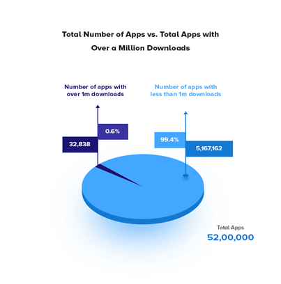
We can see how there are only a few apps which can see 1m downloads and a larger portion of apps are those which easily gets uninstalled as they do not meet the expectations.
Do not rush for too many platforms
This is one of the commonest mistakes that most brands commit. Despite rushing to launch your app in every single platform the strategy should go one by one. This is obvious that a brand fails to make its presence noticed in every single platform. Wiser planning is required for this. The amount of effort and money should always be compared with the expected desired outcomes.
Weighing the pros and cons of android, iOS and Windows a suitable decision should be made. Going into a rush with quickly, haphazardly and unplanned decisions of launching your app in every single market place can be waste.

A systemic view of events in the app
Your viewers or customer believes in what they see. Hence a logically organised flow of information which gives them relevant direction becomes essential. Random screens are big no which can confuse the users. This leads to the abandoning of the mobile application easily.
Users should be directed in such a manner that every single step of the information becomes fulfilling and entertaining to them.
Overcrowding of features
Viewers like to spend more time on a mobile application which is easy to access and understand. One of the commonest and easiest mistake to get rid of is overcrowding of the features. Too much presence of features sometimes increases the complexity of the mobile application and the viewer will end up uninstalling it. Un-purposeful additions of features which are futile should not be given priority.
Only those features should be focused upon which makes the mobile application stand alone in the crowd of thousands of application already present in the market place. Identification of the features which are not necessary should be done and removed. Overburdening of the features on the application should be avoided.
Helping guide to your viewers
Introduction to information to your viewers with the means of images can be exciting and more helpful when compared to plain text. Uses of new techniques make the mobile application more prominent. This can be done with the help of video and visuals. However, usage of these are not necessary but is quite helpful in avoiding the mistakes that can be done while using text messages.
Stick to high quality
But a common mistake that is done while using these visuals clues is on the quality of the content. Poor pixel visual tends to create hindrance in the perception. Here, the designer has to be more careful about how the appearance is presented and meet the quality expectation of the customer.
Timely roll out the updates
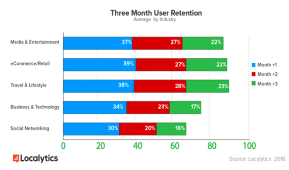
Assessment of the mobile application and its performance is an essential part of the whole mobile application system package. A developer should ensure time to time performance of the mobile application and do the necessary changes to it. A constant change is required to make the application free from bugs and errors. More updates allow more user retention.

Retention pattern shows if the mobile application is not developed properly sooner viewers lose their interest in it.
Key principles in designing a mobile app that helps us in avoiding these mistakes:
- Try to keep the design as simple and conventional as possible. Try to figure out a unique and impressive way rather than creating confusion and overcrowding. People are happier to stick with the mobile application which is easier to use with no much significant changes.
- One can use the regional and cultural additions which can influence the behaviour of the viewers. This helps in the emotional connection between the users and the mobile application. This requires extensive research so that the right information can be easily imitated into the customer’s mind.
- Use of graphics like video and pictures make the mobile app more impactful and grasping then simple text unless used in the right quality.
- Avoid any overloading of the information and rather prefer to stick to your niche with limited features but impressive and powerful.
Summing it up
Mobile application development has plenty of opportunities but as a developer, one should be able to capitalise and tap it to gain in your niche.


Lara
Very interesting info!Perfect just what I was searching for!Blog monetyze
Feel free to surf to my page EverettU